I have just put together a web site for a medical practice, using all my own photos (almost).
The clients wanted a slider (or ‘carousel’) on the home page with scenes from the business. Traditionally, sliders are long and skinny – in this case, 1280 pixels horizontally by 500 pixels vertically. That’s panorama proportions. Any taller, and you lose valuable screen space for text or other key information.
The challenge was to depict the business in an appealing way and to have aesthetically pleasing images in this very odd format. The images would be visible for only a couple of seconds before being replaced by the next one, so they had to be very simple in composition. One of my first thoughts was to try to depict the business as well equipped and modern, so I made this image:
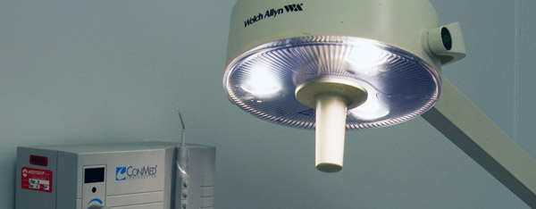
The client told me, “No good. We can’t display brand names.”
So another image along the same lines was this one, it had modern equipment and a computer, I thought it looked business-like and competent:
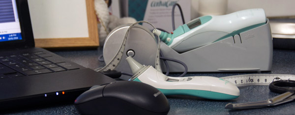
The client said, “Why are there two thermometers on the desk?” …Oh.
Ok. So maybe we show the human element – hand washing is an important activity and it also appears business-like. So this was the next possibility:
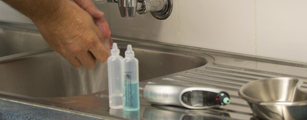
One of the doctors said disapprovingly, “Well I would never put my thermometer near splashing water.” And I wish I had put the littel bottles over to the far right – oh, well, I was rushed.
You can’t please everybody…
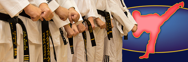
On the other hand, I have had positive comments on the images I produced for a martial arts website a few years back. Here I had more control over what I could photograph and how, and more knowledge of the topic. Probably, I also spent more time in post-production getting these to look cleaner and more effective. I am pleased with the aesthetics of these ones:
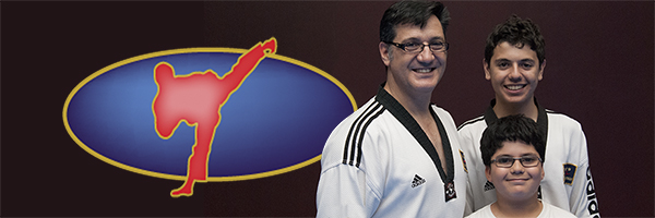
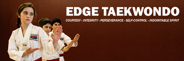

These ones are stronger images, because there is more contrast in the colours, the backgrounds are cleaner, there are people in the frame, and also because of people’s preconceptions of martial arts compared to medical care. People do not expect the same drama and intensity at a medical centre as they do at a martial arts club. The medical centre images are not “worse” because they are not as strong – they serve a different purpose and impart a different message.
So while the physical formatting and aesthetic constraints are particular to web page sliders, the underlying purpose of public images is the same: to tell a story.